
GNUplot and Python/Plot
很多软件都支持绘制各种图表。其中最典型的莫过于 Excel 了,可以拖拖拽拽画出很多漂 亮的图表。如果掌握了 Office 编程,还可以搞出很多的花样。不过有时在 Linux 机器上, 并没有 Excel 可用,还是需要 GNUplot、Python+Plot 等类似的工具。
准备
下面是一个示例的数据文件。CSV 格式,第一行为标题,列分隔符为制表符。
$ more TPC-H.dat
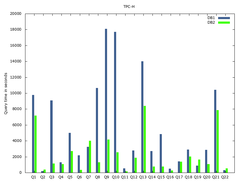
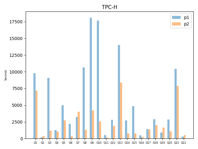
# Query DB1 DB2
Q1 9780 7181
Q2 182 393
Q3 9091 1161
Q4 1285 1051
Q5 4998 2716
Q6 2176 351
Q7 3230 4026
Q8 10654 1292
Q9 18110 4178
Q10 17699 2562
Q11 546 136
Q12 2790 1853
Q13 13990 8382
Q14 2708 770
Q15 4843 768
Q16 498 252
Q17 1428 1355
Q18 2900 2009
Q19 887 1647
Q20 2872 1061
Q21 10417 7851
Q22 291 542
GNUplot
$ more TPC-H.dot
#!/usr/bin/env gnuplot

set terminal png nocrop enhanced font "verdana,9" size 800,600
set output "TPC-H.png"

set title 'TPC-H'
set ylabel 'Query time in seconds'

set boxwidth 0.8
set style fill solid 1.00

set style data histograms
plot "TPC-H.dat" using 2:xtic(1) title 'DB1' lt rgb "#406090", "" using 3 title 'DB2' lt rgb "#40FF00"
Python
$ more TPC-H.py
# https://pythonspot.com/matplotlib/
import numpy as np
import matplotlib.pyplot as plt

plt.rcdefaults()
# "S3" is b'Q1' etc.
x, y1, y2 = np.loadtxt('../../dot/TPC-H.dat',
		       dtype={'names': ('Query', 'DB1', 'DB2'),
			      'formats': ('U3', 'float', 'float')},
		       delimiter='\t',
		       unpack=True)

y_pos = np.arange(len(x))
w = 0.3
plt.bar(y_pos - w / 2, y1, width=w, align='center', alpha=0.5)
plt.bar(y_pos + w / 2, y2, width=w, align='center', alpha=0.5)
plt.xticks(y_pos, x, fontsize=6)
plt.ylabel('Seconds', fontsize=6)
plt.title('TPC-H')
plt.legend(('p1', 'p2'))

plt.show()
[
plot
Written on November 27, 2019